


Brand
guidelines
Services
Branding,
Marketing,
UI/UX,
Product
Brand guidelines
Version 1.0 / 2025

About
Kiwigrid
This guide defines our visual language, design style, and underlying principles. It is aimed at all employees and external service providers/stakeholders and ensures a clear and consistent brand presence. It serves as a basis for both internal and external design and communication—across all teams and departments.
The specifications contained herein are binding for both internal and external projects.
These Brand Guidelines comprehensively present our identity and the values of Kiwigrid. This guide encompasses the essential design standards that bring our brand to life—from the color system and typography to the guidelines for accessibility and documentation.
Whether for digital platforms or print materials: these guidelines guarantee that every touchpoint reflects the values of trust, efficiency, and our shared commitment to an innovative energy transition which form the core of Kiwigrid.
Contents
01
Brand Strategy
02
Personality
03
Logo
04
Typography
05
Color
06
Art Direction
07
UI/UX Design
08
Productdesign
01
Brand
Strategy
We believe in a world powered by 100% renewable energy.
Vision
At Kiwigrid, we believe in a world powered 100% by renewable energy. This vision is the main driving force and inspiration for all our activities.
Mission
We aim to become Europe’s number one industry platform for next-generation energy services.

Our Corporate Objectives
- Recode Energy
- Establishing an Ecosystem
- Comprehensive Sustainability
Precise
Trustworthy
Approachable
Reliable
Our Values
Sustainability
We use economic and ecological resources responsibly and efficiently.
Collaboration
We think beyond departmental boundaries within the company and avoid silo structures to promote effective collaboration. We are convinced that we can succeed together ('better together').
Courage
We are ready to take calculated risks, think innovatively, and communicate openly. This serves to promote continuous growth and positive change. Our central ambition is to always be one step ahead, to question the status quo, and to set benchmarks for the new energy world, defined by a 'Think Big' approach.
Ownership
With our extensive expertise, we take responsibility for our tasks and the challenges in the energy world. We analyze issues and independently drive efficient solutions for our customers and partners, as we are committed to achieving and implementing results ('we get it done').
Quality
We ensure that the quality of our products exceeds our customers’ expectations. We consistently strive for the highest level of quality, without making any compromises.
02
Personality
Our communication represents Kiwigrid and our values. Through clear and goal-oriented language, we make energy management solutions simple, accessible, and stress-free. Direct, approachable, and transparent communication allows us to quickly respond to our customers' needs and identify obstacles early on.

2A
Brand Personality & Voice
Our Promise
We empower companies to provide secure, efficient, and scalable solutions for the energy transition
2B
Sample copy
Your data, precisely and correctly processed
We know: precision is crucial, especially concerning data. Even the smallest error can have a major impact on your savings and future financial goals. We ensure that your data is always processed correctly and securely.
We take care of your energy – you focus on the essentials
Your time is valuable. Complex energy management shouldn't burden you unnecessarily. We optimize your energy flows so you can concentrate on your core business.
A problem? We find the solution.
Have you encountered a problem? Don't worry, we will take care of your concern and find the appropriate solution.
03
Logo
Our logo is the hallmark of Kiwigrid and the key to our brand presence.
It symbolizes our role as a driver of the energy transition and our commitment to shaping the future of energy sustainably.
This logo is more than just a symbol – it stands for our promise to provide scalable solutions for the energy transition.
The consistent application of the logo is crucial to always present our brand as strong and recognizable.
3A
Base construction & clear space
To ensure the legibility and impact of our logo in every situation, we define a fixed clear space (protection zone). This area isolates the logo from interfering visual elements such as text or accompanying graphics.
This clear space is to be understood as an absolute minimum distance. In most cases, our logo should be given even more room to breathe to allow its full presence to unfold.


A
2.7%
5.9%
+11%
5.6 x B
B
Ax1.4


+30%

B


+27%
+27%


3B
Color variants
Our logo is available in positive and negative variants to ensure legibility in all application situations. We use these variants specifically to guarantee optimal visibility on light and dark backgrounds.


3C
App icon
We provide specific App Icons for use on various iOS and Android platforms in different resolutions. These icons ensure optimal presentation and recognition of our brand in mobile applications. Detailed specifications and file formats can be found in the corresponding design assets.
IOS Icon-App-150x150@1x

IOS Icon-App-187.5x187.5@1x

IOS Icon-App-225x225@1x

3D
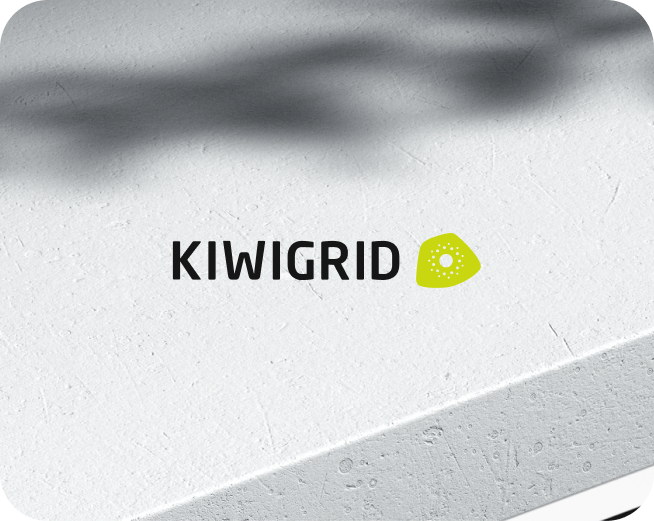
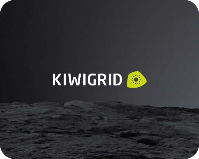
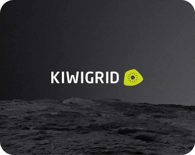
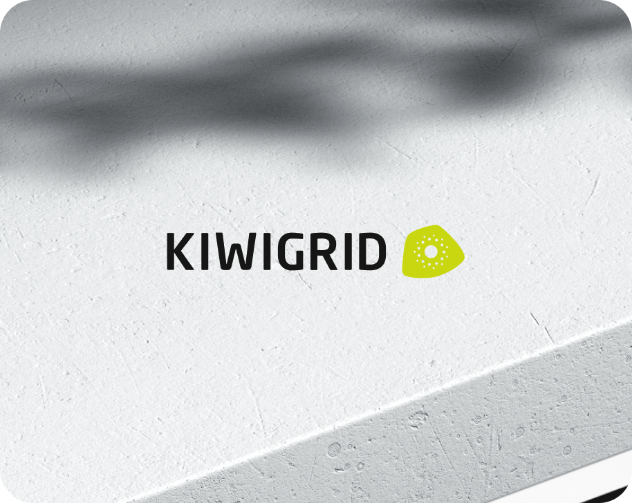
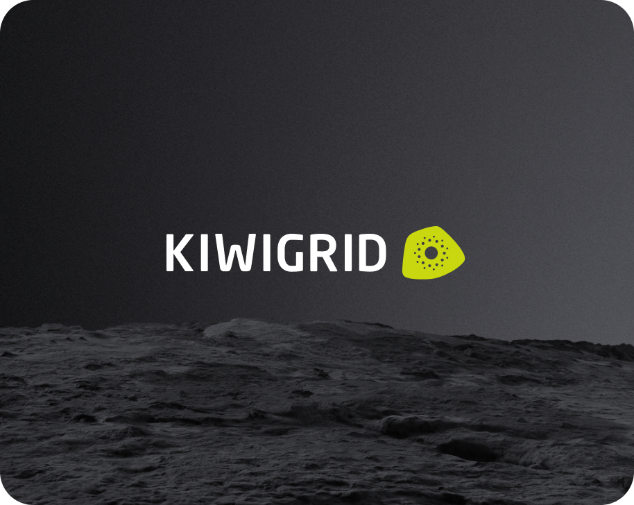
On image background
When placing our logo on image backgrounds, we always ensure optimal legibility and contrast. As a result, our logo is always recognizable on light and dark image surfaces and can fully unfold its impact.
On light surface
On dark surface
3E
Incorrect usage
To preserve the integrity and recognition of our logo, correct application is of utmost importance.
The following uses are strictly to be avoided:
- No resizing of individual elements: The logo must not be distorted, nor should individual components be changed in size.
- No rotation: The logo must not be rotated. It must always be used in its original, horizontal orientation.
- No isolated color changes: The colors of the logo must not be changed independently of the defined color palettes.
- No outline or border: The logo must not be used with an additional contour or border.
- No reversed alignment of the element: The Kiwigrid element in the logo must not be displayed mirrored or inverted.
- No color gradients: No color gradients must be added to the logo.


Do not resize the mark

Do not rotate the logo

Do not change the color of the mark alone

Do not outline the logo

Do not reverse the loook up

Do not add gradients the logo
04
Typography
Our typography is the foundation of our visual communication and significantly contributes to brand recognition. We have chosen a typeface that combines simplicity and professionalism with a modern yet timeless aesthetic. In doing so, we underline our commitment to precision, efficiency, and financial stability.
The chosen fonts are used purposefully to emphasize key points in headlines, reports, and documents. They emphasize our expertise and reliability, thus strengthening trust in the Kiwigrid brand.


Our primary typeface is the sans-serif font 'Inter'. It is clean and modern, making it the ideal choice for data-intensive content, dashboards, and user interfaces.
The secondary typeface is the sans-serif font 'Neo Sans W1G'. It is primarily used for highlights in headlines, reports, and documents.
The tertiary typeface is the monospace font 'JetBrains Mono'. We use it for technical data, code representations, data visualizations, or when a machine-written look is desired.
4A
Primary typeface
Inter
4B
Secondary typeface
Neo Sans W1G
4C
Tertiary typeface
JetBrains Mono
4D
Sizing
Title - “Display” Size
Type sizes >64 pt/px
Increment: 64 / 96 / 128 pt/px
Leading: 12 / 16 / 20 / 24 / 28 / 32 / 36 / 40
Tracking: -0.8 / -0.4 / 0 / +0.4 / +0.8 / + 1.6
Title - “Heading” Size
Type sizes >20 pt/px
Increment: 20 / 24 / 32 / 36 / 40 / 48 pt/px
Leading: 12 / 16 / 20 / 24 / 28 / 32 / 36 / 40
Tracking: -0.8 / -0.4 / 0 / +0.4 / +0.8 / + 1.6
Text - “Body” Size
Type sizes >14 pt/px
Increment: 14 / 15 / 16 pt/px
Leading: 12 / 16 / 20 / 24 / 28 / 32 / 36 / 40
Tracking: -0.8 / -0.4 / 0 / +0.4 / +0.8 / + 1.6
Text - “Helper” Size
Type sizes <14 pt/px
Increment: 10 / 11 / 12 / 13 pt/px
Leading: 12 / 16 / 20 / 24 / 28 / 32 / 36 / 40
Tracking: -0.8 / -0.4 / 0 / +0.4 / +0.8 / + 1.6
4E
Example
A differentiated weighting of headings, subheadings, and body texts significantly supports visual communication. It helps to highlight essential information while ensuring a high contrast between the individual text modules. This guarantees a clear and appealing structure for the content.
Toreprat
uriatium
Toreprat
uriatium
Toreprat
uriatium
Duntur aspedis
Lorem ipsum dolor sit amet, consetetur sadipscing elitr, sed diam nonumy eirmod tempor invidunt ut labore et dolore magna aliquyam erat, sed diam voluptua. At vero eos et accusam et justo duo dolores et ea rebum. Stet clita kasd gubergren, no sea takimata sanctus est Lorem ipsum dolor sit amet.
Heading1
Inter 34pt
Heading 2
Inter 24pt
Heading 3
Inter 16pt
Body 1
Inter 10pt
Body 2
Inter 10pt

Torepra uriatiu
nonsen
volo
Lorem ipsum dolor sit amet, consetetur sadipscing elitr, sed diam nonumy eirmod tempor invidunt ut labore et dolore magna aliquyam erat, sed diam voluptua. At vero eos et accusam et justo duo dolores et ea rebum. Stet clita kasd gubergren, no sea takimata sanctus est Lorem ipsum dolor sit amet.
Display1
Inter 64pt
Body 2
Inter 10pt
05
Color
Our color palette has been carefully selected to convey trust and reliability. We ensure that every touchpoint reflects our commitment to precision and efficiency.
Together, these colors create a strong, reliable, and future-oriented brand identity. They ensure that Kiwigrid is immediately recognized as the first choice for intelligent energy management and optimization.
5A
Primary color
Neutral
B
000000
Gray 100
161616
Gray 90
262626
Gray 80
393939
Gray 70
525252
B
hover
252525
Gray 100
hover
272727
Gray 90
hover
333333
Gray 80
hover
4c4c4c
Gray 70
hover
636363

Gray 60
6f6f6f
Gray 50
8d8d8d
Gray 40
a8a8a8
Gray 30
c6c6c6
Gray 10
f4f4f4
W
ffffff
Gray 60
hover
5e5e5e
Gray 50
hover
7A7A7A
Gray 40
hover
999999
Gray 30
hover
B5B5B5
Gray 20
hover
cacaca
Gray 10
hover
e8e8e8
Gray 10
hover
e8e8e8
Kiwi Green
Kiwi 100
040401
Kiwi 90
292909
Kiwi 80
4F510E
Kiwi 70
777B11
Kiwi 60
9FA811
Kiwi 50
C8D70F
Kiwi 40
E2F222
Kiwi 30
E9F64C
Kiwi 20
EFFA76
Kiwi 10
F5FCA2
Kiwi 5
FAFECE
CMYK 30/0/95/0
RGB 200 215 15
HSB 63°, 0.92%, 0.84%
LAB 82.33, -25.11, 80.31
Pantone 382 C
HKS 69 (approximately)
RAL 1016
Kiwi Sky
Sky 100
848D72
Sky 90
ACB49A
Sky 80
BDC3AC
Sky 70
CDD2BF
Sky 60
DDE0D2
Sky 50
ECEEE5
Sky 40
F0F1EA
Sky 30
F3F4EE
Sky 20
F7F7F3
Sky 10
FAFAF7
Sky 5
FDFDFC
CMYK 0/0/2/4
RGB 243 244 238
HSL 70, 0.21%, 0.95%
LAB 95.97, -1.38, 2.76
5B
Secondary color
Orange
Orange
100
692B04
Orange
90
973C04
Orange
80
C44F05
Orange
70
F25F05
Orange
60
FD7828
Orange
50
FF9454
Orange
40
FFA975
Orange
30
FFBF96
Orange
20
FFD3B8
Orange
10
FFE8D9
Orange
5
FFFCFA
Teal
Teal 100
3C8686
Teal 90
47A9A9
Teal 80
61BCBD
Teal 70
80CCCC
Teal 60
A0DADA
Teal 50
C0E8E8
Teal 40
CEEAEA
Teal 30
DBEEEE
Teal 20
E7F2F2
Teal 10
F2F7F7
Teal 5
FCFDFD
Blue
Blue
100
010204
Blue 90
09152A
Blue 80
0E2B52
Blue 70
11447D
Blue 60
0072C3
Blue 50
0C73B7
Blue 40
2092D9
Blue 30
40B1F2
Blue 20
8ACFF7
Blue 10
BEE6FB
Blue 5
E7F6FD
5C
Color Balance
To ensure optimal visual harmony and legibility in various digital environments, we define a specific color balance for Light Mode and Dark Mode. This ensures that our brand colors appear consistent and effective in both display modes.
The percentage specifications indicate the recommended distribution of primary and accent colors within these modes to create the optimal visual experience.
Light Mode
55%
20%
10%
10%
5%
Dark Mode
55%
20%
10%
10%
5%
5D
Background blur
To optimize the legibility of information on image-based or complex backgrounds, we specifically use a blur effect. This effect directs attention to important elements by subtly fading the background.
We define specific opacity and color values to ensure a clear hierarchy and a pleasant visual aesthetic at all times.
Energy consumtion
87
%

0.9%
Color: #161616
Effect: background-blur-lg
Opacity: 45%
Energy consumtion
87
%

0.9%
Color: #C8D70F
Effect: background-blur-lg
Opacity: 45%
Energy consumtion
87
%
0.9%
Color: #000000
Effect: background-blur-lg
Opacity: 45%
5E
Gradient
We use color gradients strategically to give our designs depth and dynamics and to create a modern, flowing transition between colors. They are used particularly in backgrounds, as atmospheric elements, or for the subtle emphasis of visual areas.
In doing so, we ensure that the gradients always appear harmonious and brand-compliant.
Background gradient “Light”


Background gradient “Dark”

06
Art Direction
Our Art Direction guides the entire visual design of our brand communication. It ensures that our visual language – from photography to illustrations – always corresponds to our values and personality.
We create a consistent, modern, and future-oriented aesthetic that reduces complexity and presents our solutions as approachable and understandable.
6A
Photography
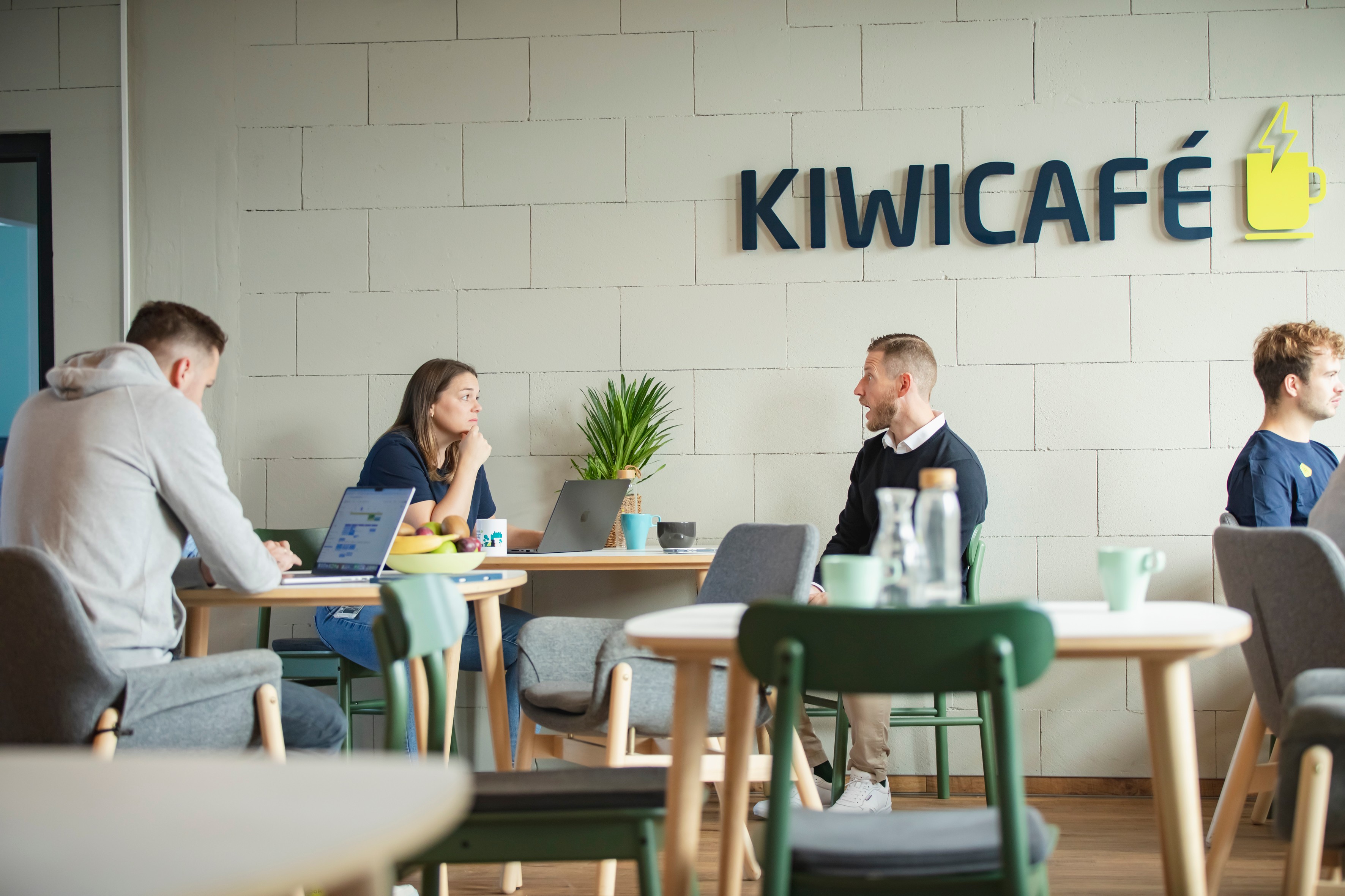
Our photography is a crucial element for making the Kiwigrid brand visually tangible. We rely on an authentic, dynamic, and human-centered visual language. Our images show real situations and real people interacting with energy and technology.
We avoid staged or overly retouched shots. Instead, we favor natural lighting conditions and a clear image composition that reflects openness and transparency. The depicted scenes focus on innovation, collaboration, and the positive impact of our solutions on people and the environment in the context of the energy transition.


6B
Artworks
We use our illustrations and graphics to visually simplify complex matters and convey our messages in an appealing way. We employ a clear, modern, and reduced illustration style that is characterized by precise lines and the deliberate use of our brand colors.
Type 01

Type 03

Type 02

Type 04

07
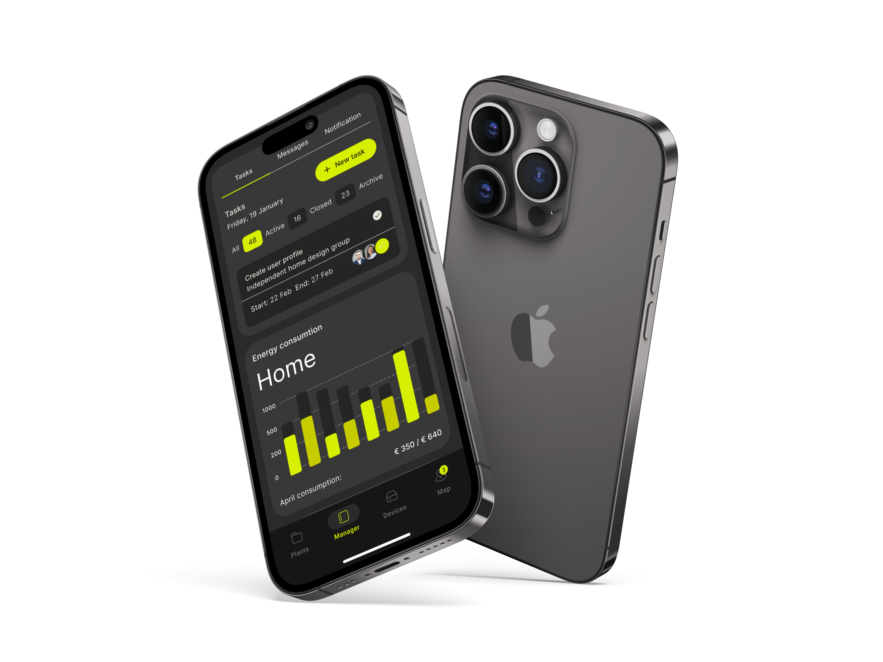
UI/UX
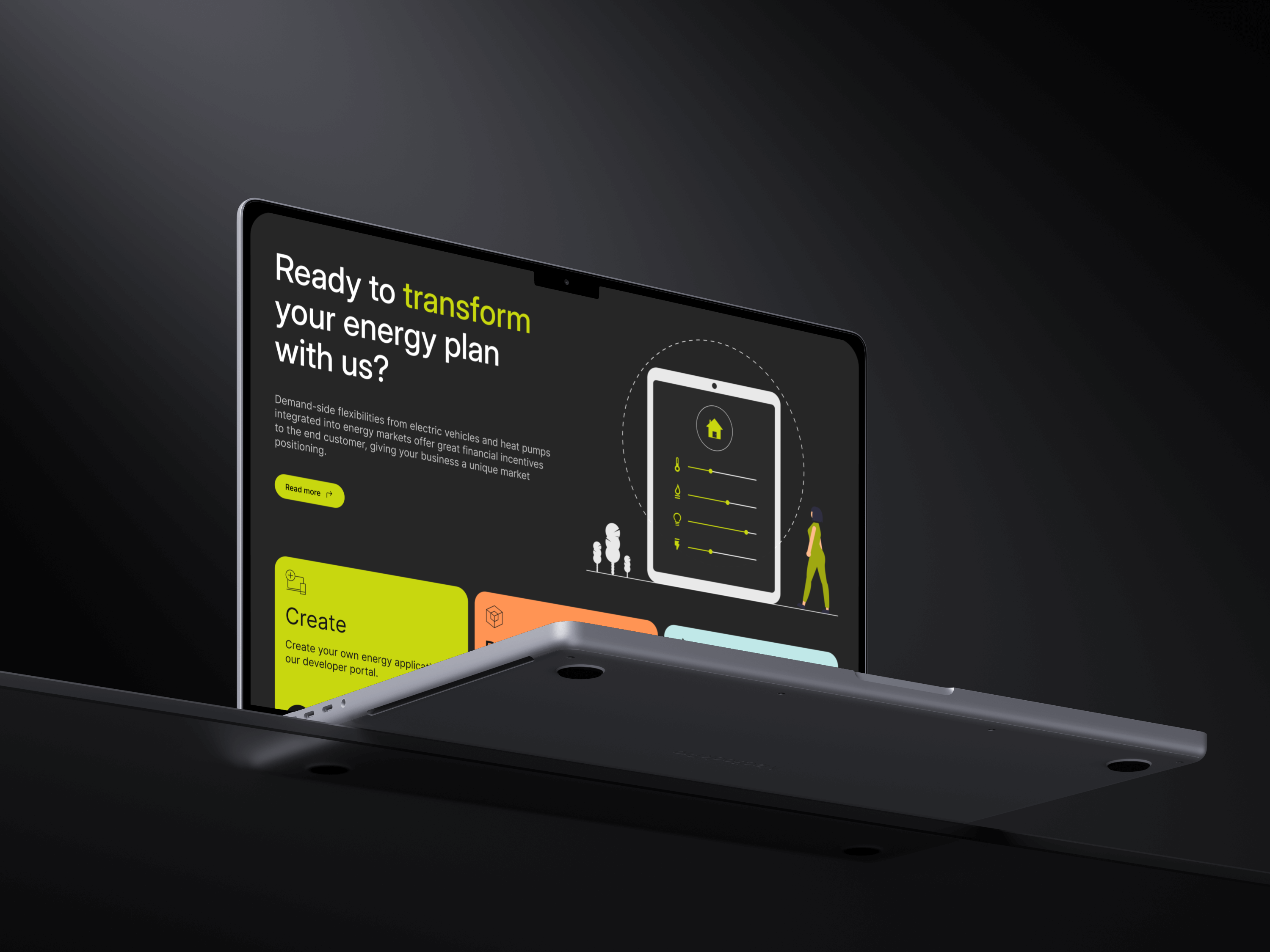
Design
UI/UX design is of central importance to us, as it forms the direct interface to our products and digital solutions. We place the highest value on an intuitive, efficient, and user-centered design that makes our brand values tangible at every digital touchpoint.
This section defines the principles and guidelines for our UI/UX design to ensure a consistent, functional, and aesthetically pleasing user experience across all our digital platforms and applications. Detailed specifications and design patterns can be found in the respective design systems and libraries.
08
Product
Design
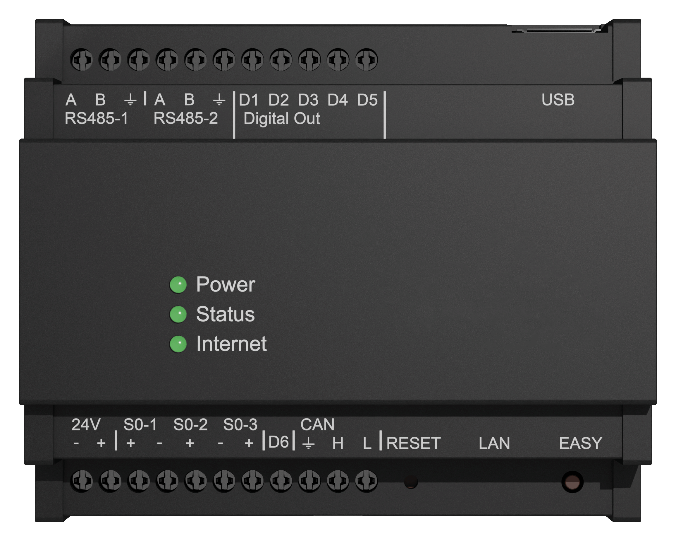
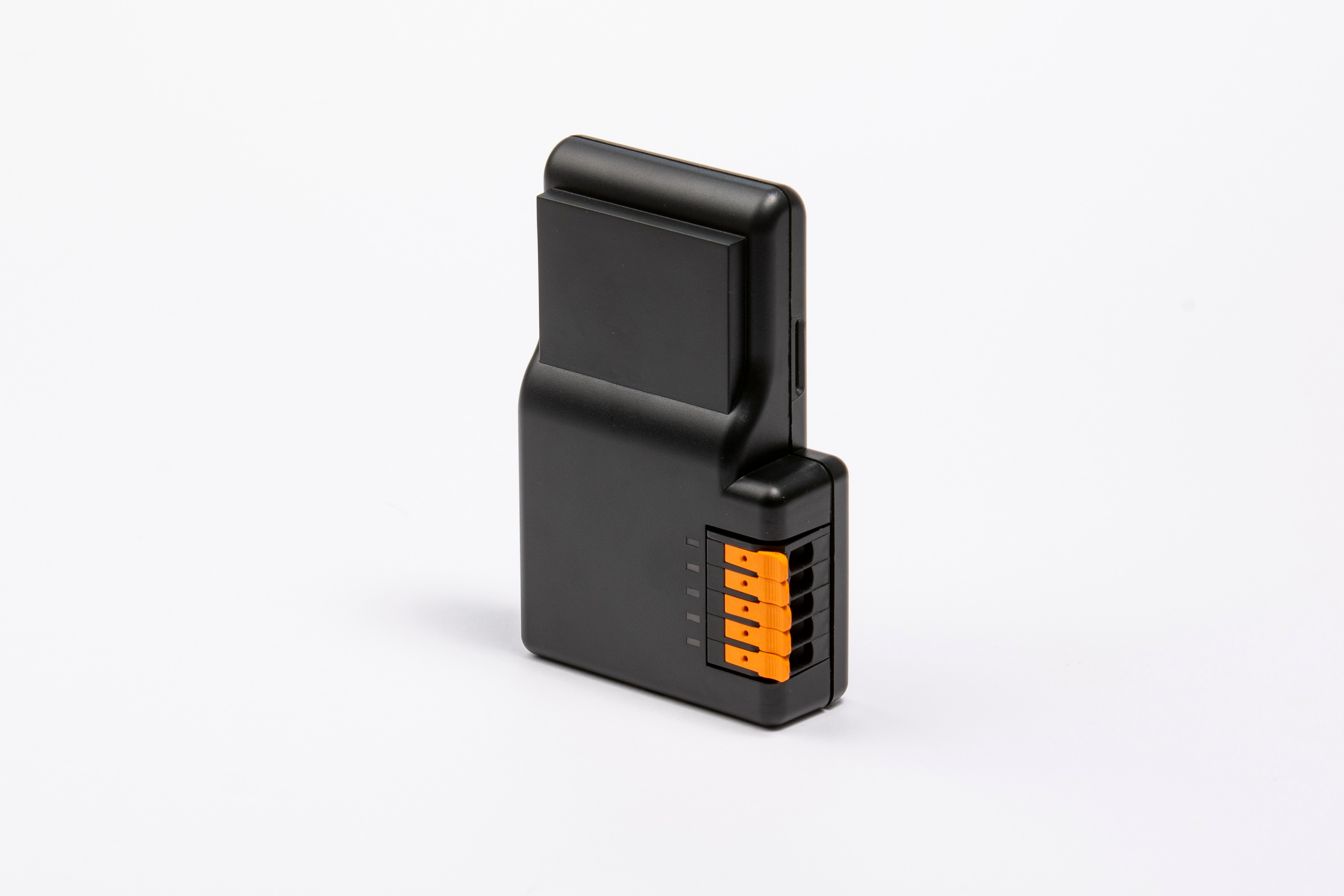
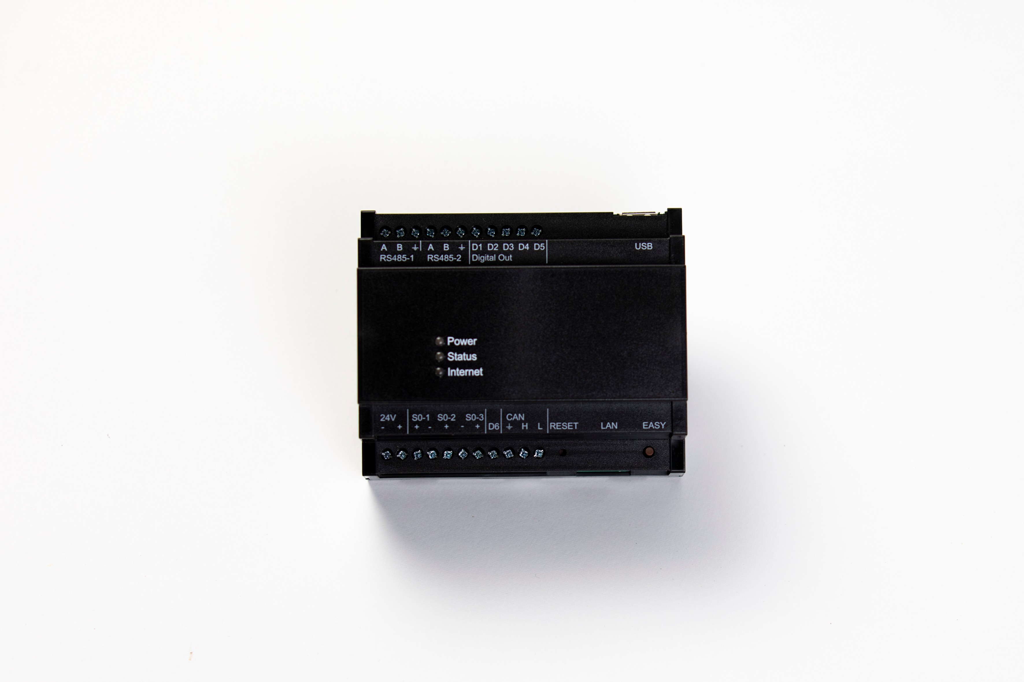
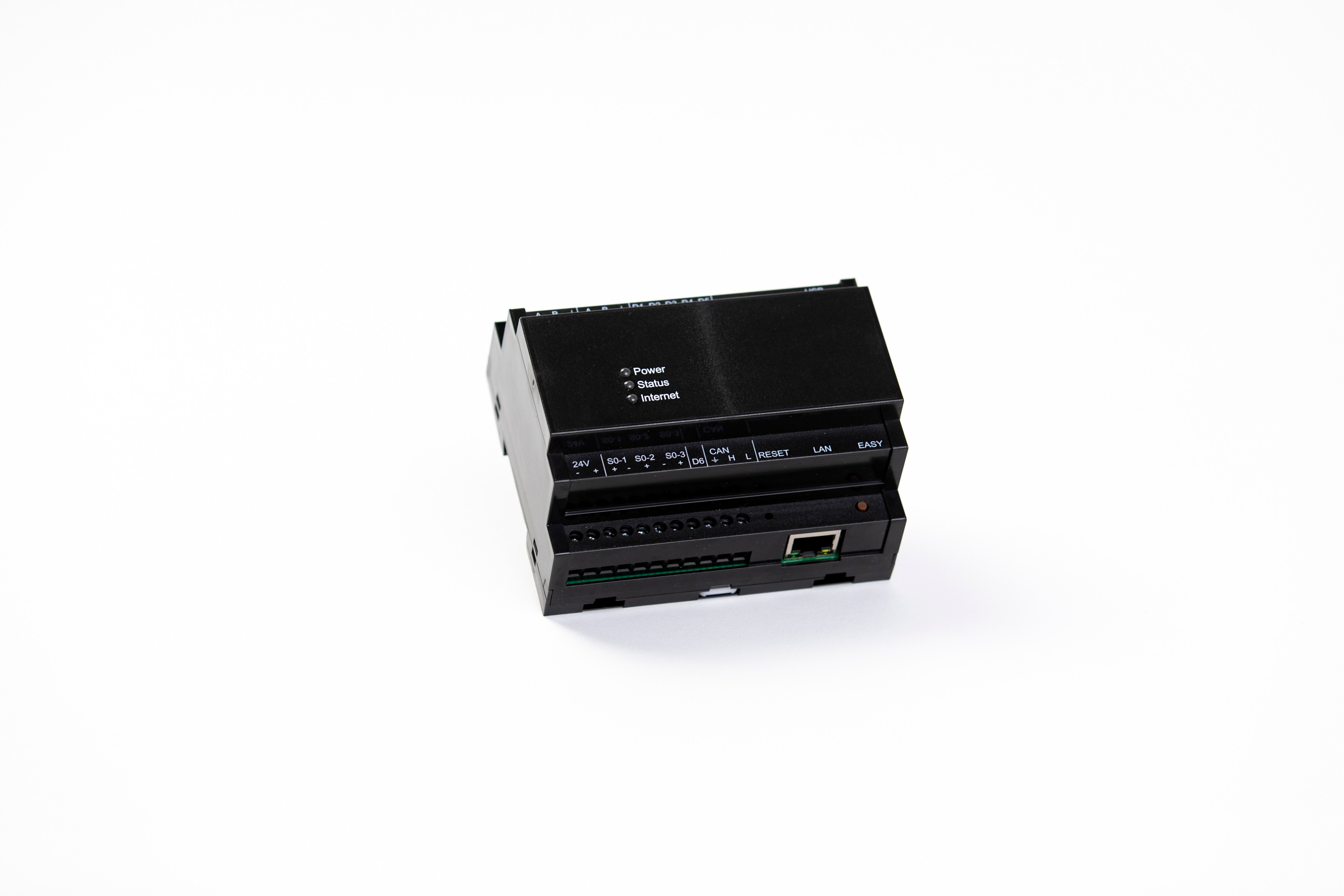
The design of our hardware is the direct embodiment of our innovative strength and quality. We pursue a coherent design language that extends across all product areas and clearly communicates our technological leadership.
In doing so, we rely on cool, neutral colors that emphasize our precision and high quality. The clear shaping with precise edges and surfaces supports this claim.
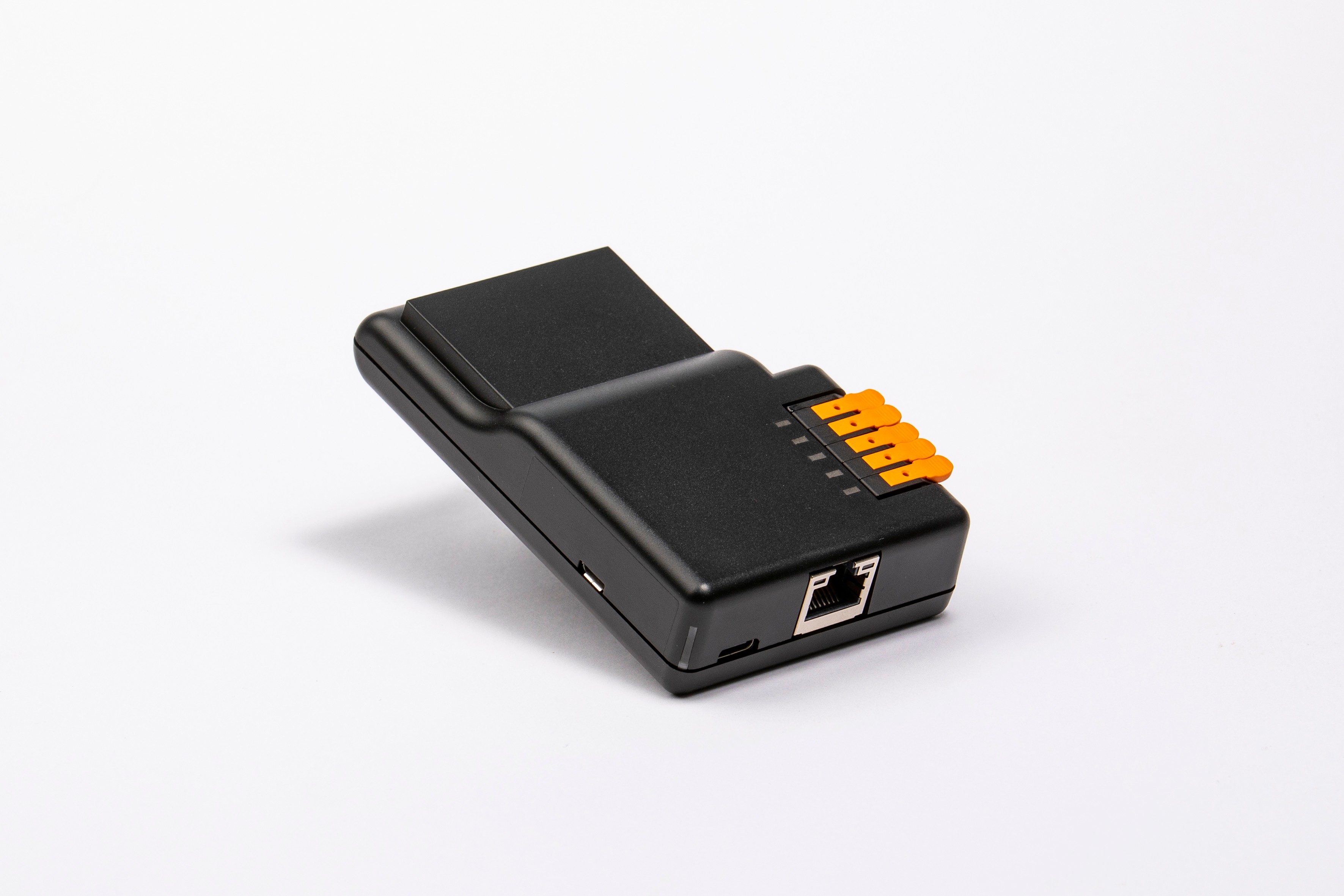
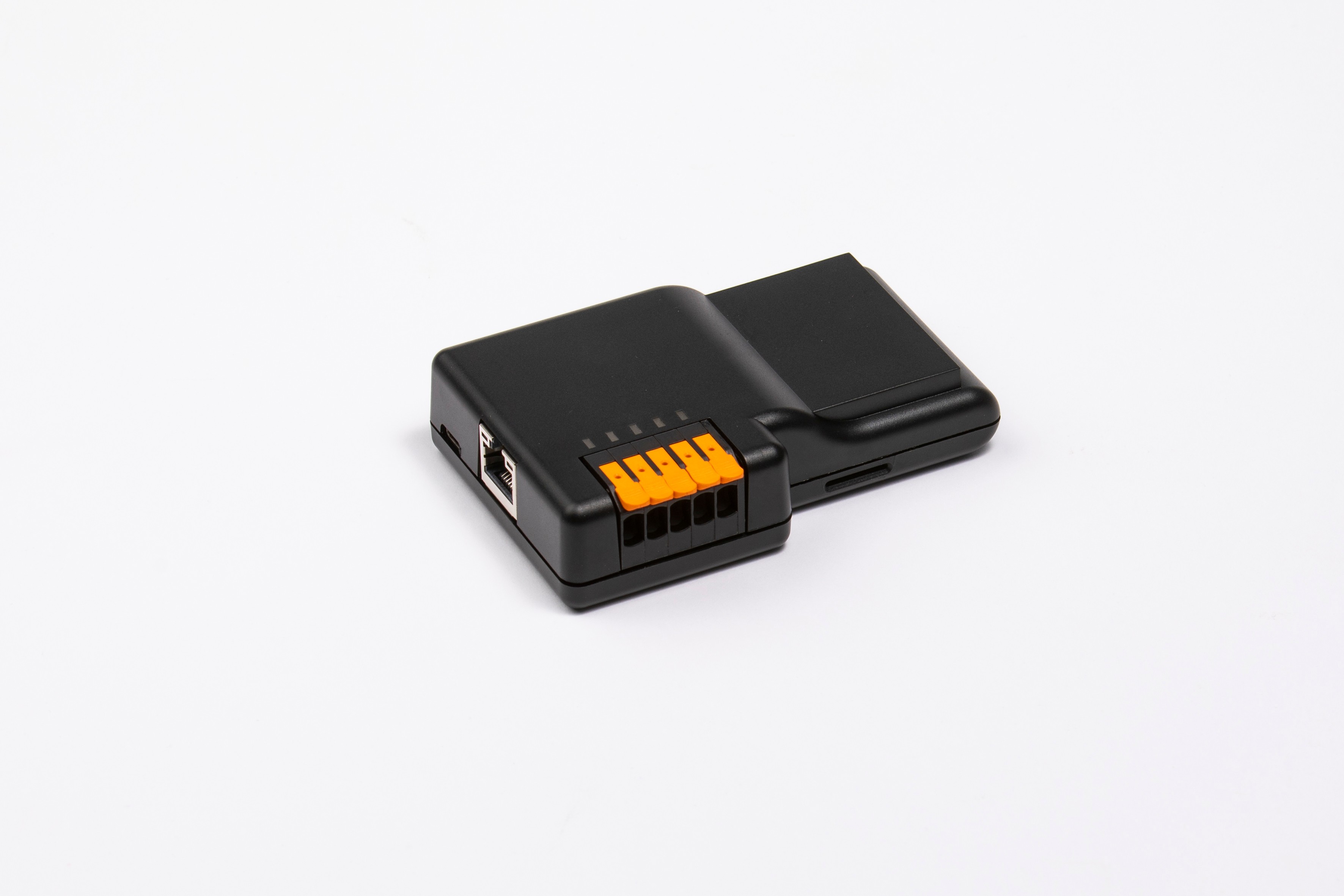
08A
Energy Manager VoyagerX
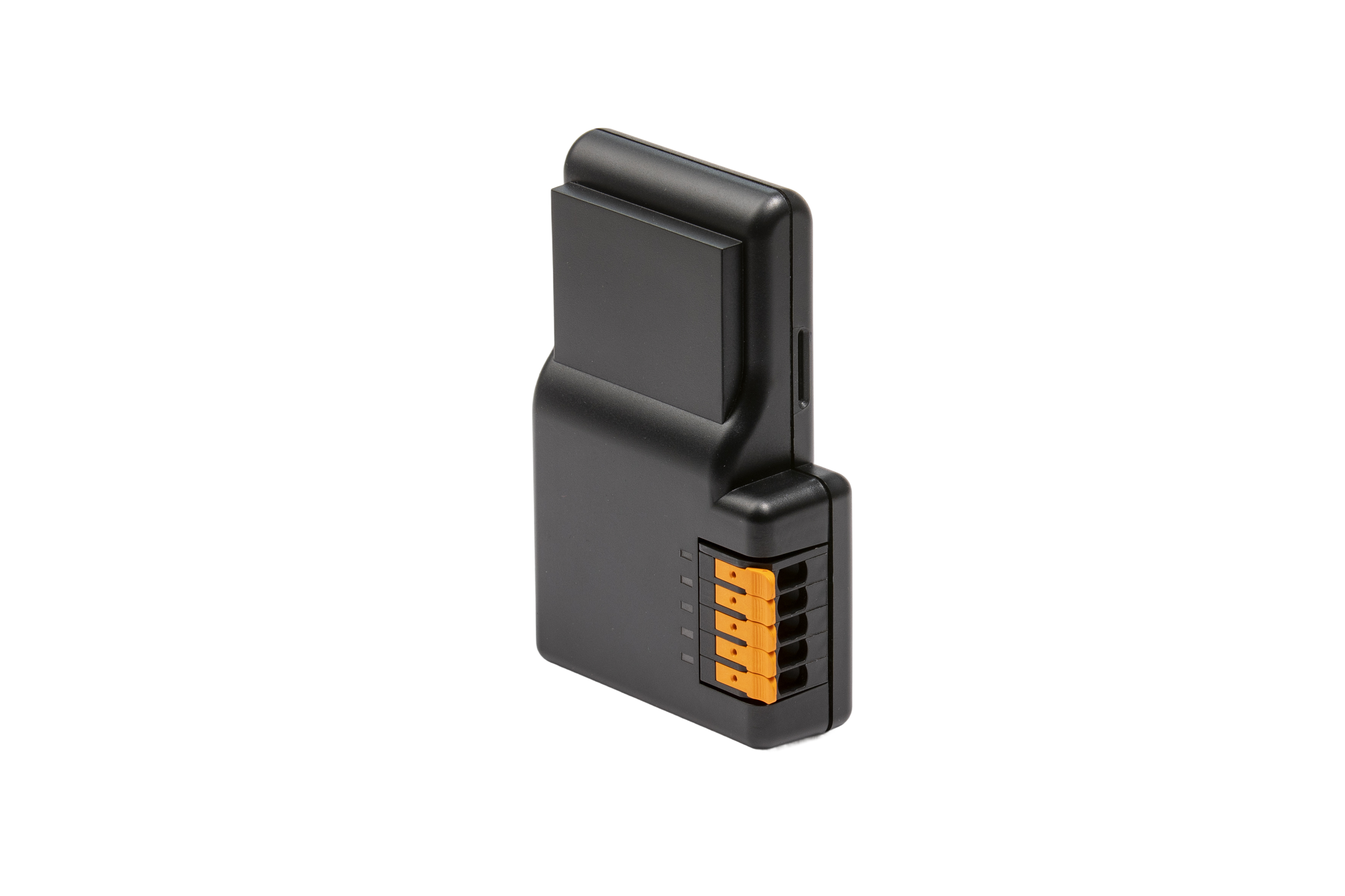
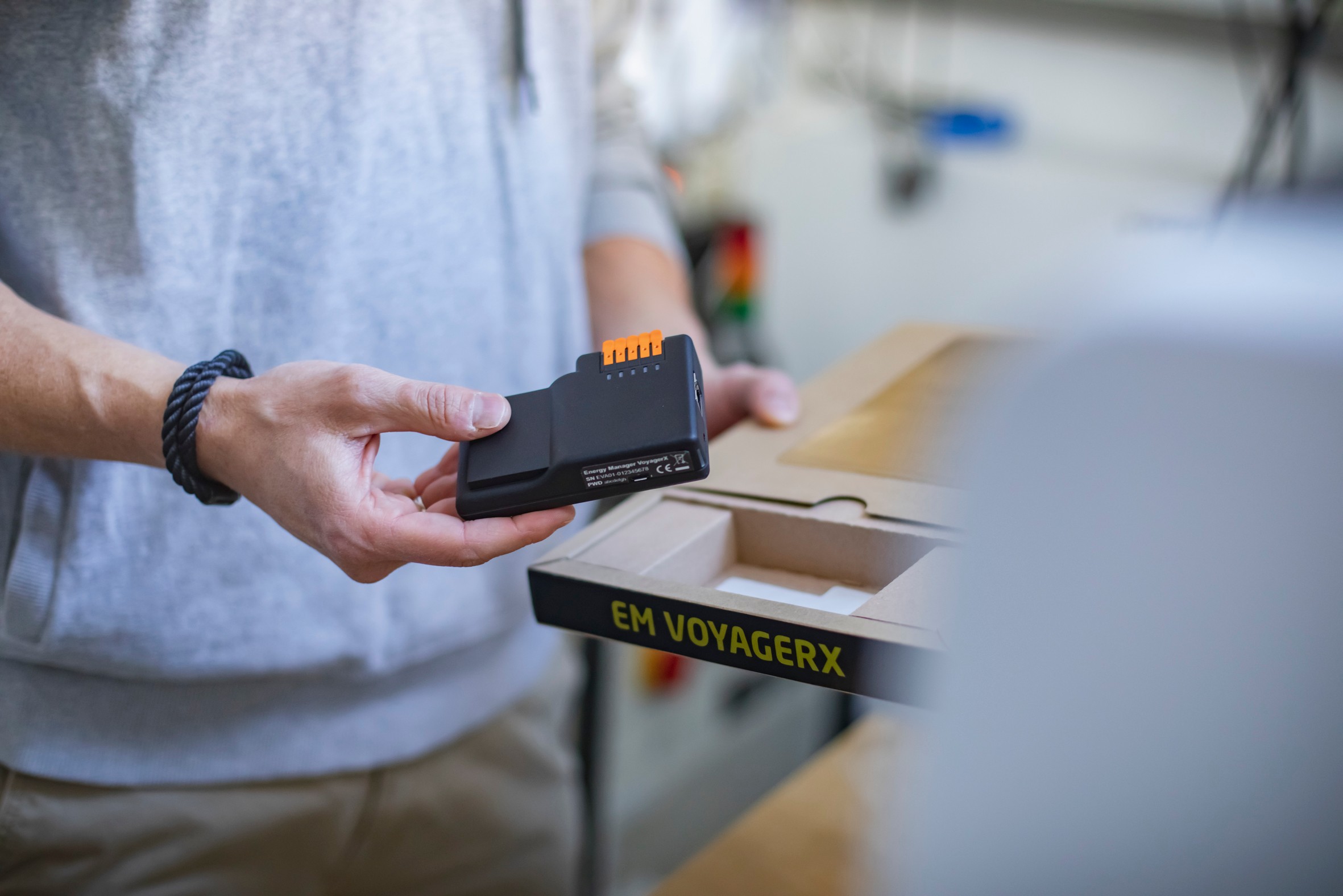
The Energy Manager VoyagerX, with its compact, minimalist form, stands for flexibility and accessibility. It was deliberately designed to integrate inconspicuously and decentrally into any environment and to bring the control out of the switch cabinet.
01
02
03
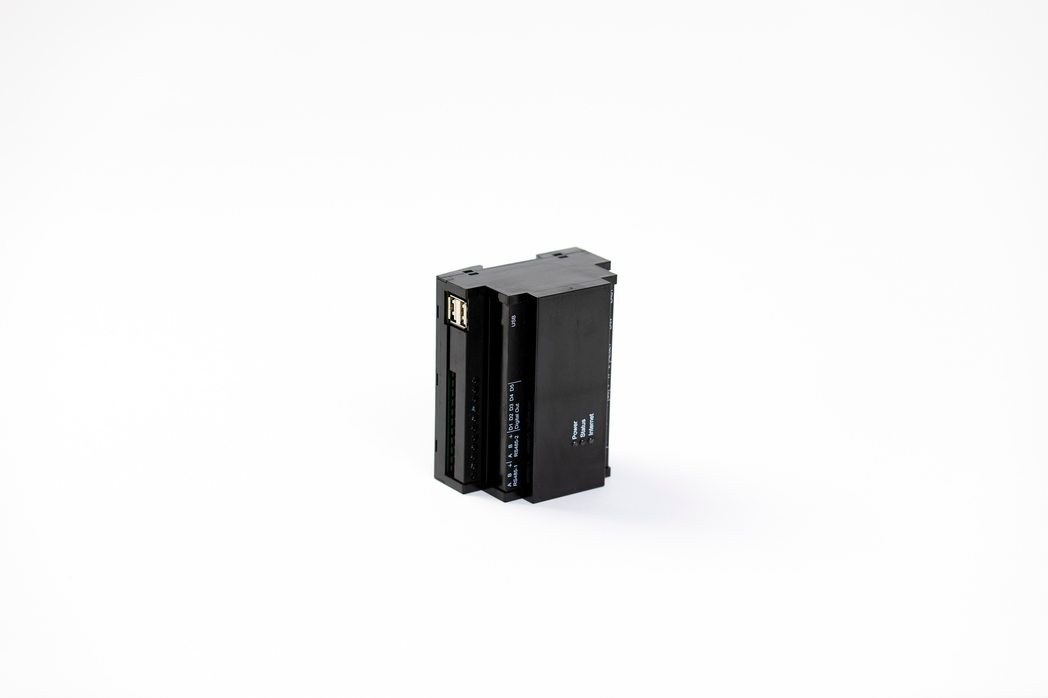
08B
Energy Manager RailX
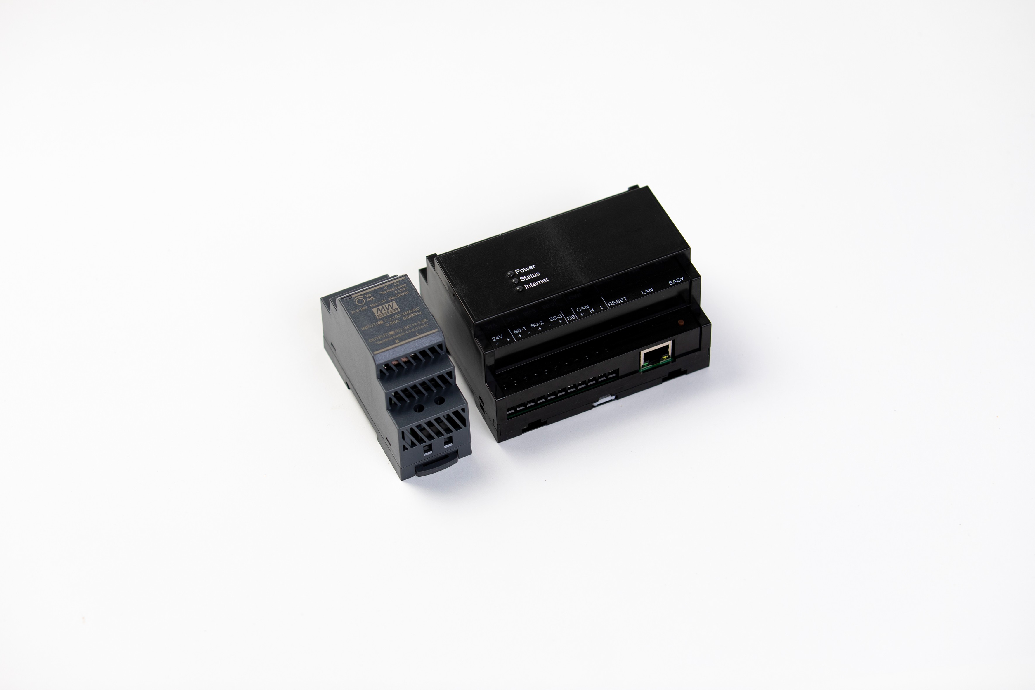
The Energy Manager RailX embodies professionalism and integration. Its robust design language, optimized for the DIN rail, communicates reliability and enables seamless integration into existing, professional infrastructures.
04
08C
Packaging
Our product packaging is an integral part of the customer experience and an important extension of our brand identity. We design packaging that not only securely protects our products but also visually communicates our brand values such as precision, quality, and our commitment to innovative solutions.
We place value on a design that is clear, functional, and aesthetically pleasing. The packaging reflects the high-quality nature of our products and ensures a consistent brand presence from the very first point of contact.


Contact Us
01
Strategy
02
Personality
03
Logo
04
Typography
05
Color
06
Art direction
07
UI/UX
08
Product design


Brand
guidelines
Services
Branding,
Marketing,
UI/UX,
Product
Brand guidelines
Version 1.0 / 2025
About
Kiwigrid
This guide defines our visual language, design style, and underlying principles. It is aimed at all employees and external service providers/stakeholders and ensures a clear and consistent brand presence. It serves as a basis for both internal and external design and communication—across all teams and departments.
The specifications contained herein are binding for both internal and external projects.
These Brand Guidelines comprehensively present our identity and the values of Kiwigrid. This guide encompasses the essential design standards that bring our brand to life—from the color system and typography to the guidelines for accessibility and documentation.
Whether for digital platforms or print materials: these guidelines guarantee that every touchpoint reflects the values of trust, efficiency, and our shared commitment to an innovative energy transition which form the core of Kiwigrid.
Contents
01
Brand Strategy
02
Personality
03
Logo
04
Typography
05
Color
06
Art Direction
07
UI/UX Design
08
Productdesign
01
Brand
Strategy
We believe in a world powered by 100% renewable energy.
Vision
At Kiwigrid, we believe in a world powered 100% by renewable energy. This vision is the main driving force and inspiration for all our activities.
Mission
We aim to become Europe’s number one industry platform for next-generation energy services.
Our Corporate Objectives
- Recode Energy
- Establishing an Ecosystem
- Comprehensive Sustainability
Precise
Trustworthy
Approachable
Reliable
Our Values
Sustainability
We use economic and ecological resources responsibly and efficiently.
Collaboration
We think beyond departmental boundaries within the company and avoid silo structures to promote effective collaboration. We are convinced that we can succeed together ('better together').
Courage
We are ready to take calculated risks, think innovatively, and communicate openly. This serves to promote continuous growth and positive change. Our central ambition is to always be one step ahead, to question the status quo, and to set benchmarks for the new energy world, defined by a 'Think Big' approach.
Ownership
With our extensive expertise, we take responsibility for our tasks and the challenges in the energy world. We analyze issues and independently drive efficient solutions for our customers and partners, as we are committed to achieving and implementing results ('we get it done').
Quality
We ensure that the quality of our products exceeds our customers’ expectations. We consistently strive for the highest level of quality, without making any compromises.
02
Personality
Our communication represents Kiwigrid and our values. Through clear and goal-oriented language, we make energy management solutions simple, accessible, and stress-free. Direct, approachable, and transparent communication allows us to quickly respond to our customers' needs and identify obstacles early on.
2A
Brand Personality & Voice
Our Promise
We empower companies to provide secure, efficient, and scalable solutions for the energy transition
2B
Sample copy
Your data, precisely and correctly processed
We know: precision is crucial, especially concerning data. Even the smallest error can have a major impact on your savings and future financial goals. We ensure that your data is always processed correctly and securely.
We take care of your energy – you focus on the essentials
Your time is valuable. Complex energy management shouldn't burden you unnecessarily. We optimize your energy flows so you can concentrate on your core business.
A problem? We find the solution.
Have you encountered a problem? Don't worry, we will take care of your concern and find the appropriate solution.
03
Logo
Our logo is the hallmark of Kiwigrid and the key to our brand presence.
It symbolizes our role as a driver of the energy transition and our commitment to shaping the future of energy sustainably.
This logo is more than just a symbol – it stands for our promise to provide scalable solutions for the energy transition.
The consistent application of the logo is crucial to always present our brand as strong and recognizable.
3A
Base construction & clear space
To ensure the legibility and impact of our logo in every situation, we define a fixed clear space (protection zone). This area isolates the logo from interfering visual elements such as text or accompanying graphics.
This clear space is to be understood as an absolute minimum distance. In most cases, our logo should be given even more room to breathe to allow its full presence to unfold.

A
2.7%
5.9%
+11%
5.6 x B
B
Ax1.4


+30%

B


+27%
+27%


3B
Color variants
Our logo is available in positive and negative variants to ensure legibility in all application situations. We use these variants specifically to guarantee optimal visibility on light and dark backgrounds.


3C
App icon
We provide specific App Icons for use on various iOS and Android platforms in different resolutions. These icons ensure optimal presentation and recognition of our brand in mobile applications. Detailed specifications and file formats can be found in the corresponding design assets.
IOS Icon-App
150x150@1x

IOS Icon-App
187.5x187.5@1x

IOS Icon-App
225x225@1x
3D
On image background
When placing our logo on image backgrounds, we always ensure optimal legibility and contrast. As a result, our logo is always recognizable on light and dark image surfaces and can fully unfold its impact.
On light surface
On dark surface
3E
Incorrect usage
To preserve the integrity and recognition of our logo, correct application is of utmost importance.
The following uses are strictly to be avoided:
- No resizing of individual elements: The logo must not be distorted, nor should individual components be changed in size.
- No rotation: The logo must not be rotated. It must always be used in its original, horizontal orientation.
- No isolated color changes: The colors of the logo must not be changed independently of the defined color palettes.
- No outline or border: The logo must not be used with an additional contour or border.
- No reversed alignment of the element: The Kiwigrid element in the logo must not be displayed mirrored or inverted.
- No color gradients: No color gradients must be added to the logo.

Do not resize the mark

Do not rotate the logo

Do not change the color of the mark alone

Do not outline the logo

Do not reverse the loook up

Do not add gradients the logo
04
Typography
Our typography is the foundation of our visual communication and significantly contributes to brand recognition. We have chosen a typeface that combines simplicity and professionalism with a modern yet timeless aesthetic. In doing so, we underline our commitment to precision, efficiency, and financial stability.
The chosen fonts are used purposefully to emphasize key points in headlines, reports, and documents. They emphasize our expertise and reliability, thus strengthening trust in the Kiwigrid brand.

Our primary typeface is the sans-serif font 'Inter'. It is clean and modern, making it the ideal choice for data-intensive content, dashboards, and user interfaces.
The secondary typeface is the sans-serif font 'Neo Sans W1G'. It is primarily used for highlights in headlines, reports, and documents.
The tertiary typeface is the monospace font 'JetBrains Mono'. We use it for technical data, code representations, data visualizations, or when a machine-written look is desired.
4A
Primary typeface
Inter
4B
Secondary typeface
Neo Sans W1G
4C
Tertiary typeface
JetBrains Mono
4D
Sizing
Title - “Display” Size
Type sizes >64 pt/px
Increment: 64 / 96 / 128 pt/px
Leading: 12 / 16 / 20 / 24 / 28 / 32 / 36 / 40
Tracking: -0.8 / -0.4 / 0 / +0.4 / +0.8 / + 1.6
Title - “Heading” Size
Type sizes >20 pt/px
Increment: 20 / 24 / 32 / 36 / 40 / 48 pt/px
Leading: 12 / 16 / 20 / 24 / 28 / 32 / 36 / 40
Tracking: -0.8 / -0.4 / 0 / +0.4 / +0.8 / + 1.6
Text - “Body” Size
Type sizes >14 pt/px
Increment: 14 / 15 / 16 pt/px
Leading: 12 / 16 / 20 / 24 / 28 / 32 / 36 / 40
Tracking: -0.8 / -0.4 / 0 / +0.4 / +0.8 / + 1.6
Text - “Helper” Size
Type sizes <14 pt/px
Increment: 10 / 11 / 12 / 13 pt/px
Leading: 12 / 16 / 20 / 24 / 28 / 32 / 36 / 40
Tracking: -0.8 / -0.4 / 0 / +0.4 / +0.8 / + 1.6
4E
Example
A differentiated weighting of headings, subheadings, and body texts significantly supports visual communication. It helps to highlight essential information while ensuring a high contrast between the individual text modules. This guarantees a clear and appealing structure for the content.
Toreprat
uriatium
Toreprat
uriatium
Toreprat
uriatium
Duntur aspedis
Lorem ipsum dolor sit amet, consetetur sadipscing elitr, sed diam nonumy eirmod tempor invidunt ut labore et dolore magna aliquyam erat, sed diam voluptua. At vero eos et accusam et justo duo dolores et ea rebum. Stet clita kasd gubergren, no sea takimata sanctus est Lorem ipsum dolor sit amet.
Lorem ipsum dolor sit amet, consetetur sadipscing elitr, sed diam nonumy eirmod tempor invidunt ut labore et dolore magna aliquyam erat, sed diam voluptua. At vero eos et accusam et justo duo dolores et ea rebum. Stet clita kasd gubergren, no sea takimata sanctus est Lorem ipsum dolor sit amet.
Heading1
Inter
34pt

Heading 2
Inter
24pt
Heading 3
Inter
16pt
Body 1
Inter
10pt
Body 2
Inter
10pt
Torepra
uriatiu
nonsen
volo
Lorem ipsum dolor sit amet, consetetur sadipscing elitr, sed diam nonumy eirmod tempor invidunt ut labore et dolore magna aliquyam erat, sed diam voluptua. At vero eos et accusam et justo duo dolores et ea rebum. Stet clita kasd gubergren, no sea takimata sanctus est Lorem ipsum dolor sit amet.

Display1
Inter
64pt

Body 2
Inter
10pt
05
Color
Our color palette has been carefully selected to convey trust and reliability. We ensure that every touchpoint reflects our commitment to precision and efficiency.
Together, these colors create a strong, reliable, and future-oriented brand identity. They ensure that Kiwigrid is immediately recognized as the first choice for intelligent energy management and optimization.
5A
Primary color
Neutral
B
000000
Gray 100
161616
Gray 90
262626
Gray 80
393939
Gray 70
525252
B
hover
252525
Gray 100
hover
272727
Gray 90
hover
333333
Gray 80
hover
4c4c4c
Gray 70
hover
636363

Gray 60
6f6f6f
Gray 50
8d8d8d
Gray 40
a8a8a8
Gray 30
c6c6c6
Gray 10
f4f4f4
W
ffffff
Gray 60
hover
5e5e5e
Gray 50
hover
7A7A7A
Gray 40
hover
999999
Gray 30
hover
B5B5B5
Gray 20
hover
cacaca
Gray 10
hover
e8e8e8
Gray 10
hover
e8e8e8

Lighten

Darken
Kiwi Green
Kiwi 100
040401
Kiwi 90
292909
Kiwi 80
4F510E
Kiwi 70
777B11
Kiwi 60
9FA811
Kiwi 50
C8D70F
Kiwi 40
E2F222
Kiwi 30
E9F64C
Kiwi 20
EFFA76
Kiwi 10
F5FCA2
Kiwi 5
FAFECE
CMYK 30/0/95/0
RGB 200 215 15
HSB 63°, 0.92%, 0.84%
LAB 82.33, -25.11, 80.31
Pantone 382 C
HKS 69 (approximately)
RAL 1016
Kiwi Sky
Sky 100
848D72
Sky 90
ACB49A
Sky 80
BDC3AC
Sky 70
CDD2BF
Sky 60
DDE0D2
Sky 50
ECEEE5
Sky 40
F0F1EA
Sky 30
F3F4EE
Sky 20
F7F7F3
Sky 10
FAFAF7
Sky 5
FDFDFC
CMYK 0/0/2/4
RGB 243 244 238
HSL 70, 0.21%, 0.95%
LAB 95.97, -1.38, 2.76
5B
Secondary color
Orange
Orange
100
692B04
Orange
90
973C04
Orange
80
C44F05
Orange
70
F25F05
Orange
60
FD7828
Orange
50
FF9454
Orange
40
FFA975
Orange
30
FFBF96
Orange
20
FFD3B8
Orange
10
FFE8D9
Orange
5
FFFCFA
Teal
Teal 100
3C8686
Teal 90
47A9A9
Teal 80
61BCBD
Teal 70
80CCCC
Teal 60
A0DADA
Teal 50
C0E8E8
Teal 40
CEEAEA
Teal 30
DBEEEE
Teal 20
E7F2F2
Teal 10
F2F7F7
Teal 5
FCFDFD
Blue
Blue 100
010204
Blue 90
09152A
Blue 80
0E2B52
Blue 70
11447D
Blue 60
0072C3
Blue 50
0C73B7
Blue 40
2092D9
Blue 30
40B1F2
Blue 20
8ACFF7
Blue 10
BEE6FB
Blue 5
E7F6FD
5C
Color Balance
To ensure optimal visual harmony and legibility in various digital environments, we define a specific color balance for Light Mode and Dark Mode. This ensures that our brand colors appear consistent and effective in both display modes.
The percentage specifications indicate the recommended distribution of primary and accent colors within these modes to create the optimal visual experience.
Light Mode
55%
20%
10%
10%
5%
Dark Mode
55%
20%
10%
10%
5%
5D
Background blur
To optimize the legibility of information on image-based or complex backgrounds, we specifically use a blur effect. This effect directs attention to important elements by subtly fading the background.
We define specific opacity and color values to ensure a clear hierarchy and a pleasant visual aesthetic at all times.
Energy consumtion
87
%
0.9%
Color: #161616
Effect: background-blur-lg
Opacity: 45%
Energy consumtion
87
%
0.9%
Color: #C8D70F
Effect: background-blur-lg
Opacity: 45%
Energy consumtion
87
%
0.9%
Color: #000000
Effect: background-blur-lg
Opacity: 45%
5E
Gradient
We use color gradients strategically to give our designs depth and dynamics and to create a modern, flowing transition between colors. They are used particularly in backgrounds, as atmospheric elements, or for the subtle emphasis of visual areas.
In doing so, we ensure that the gradients always appear harmonious and brand-compliant.
Background gradient “Light”


Background gradient “Dark”


06
Art Direction
Our Art Direction guides the entire visual design of our brand communication. It ensures that our visual language – from photography to illustrations – always corresponds to our values and personality.
We create a consistent, modern, and future-oriented aesthetic that reduces complexity and presents our solutions as approachable and understandable.
6A
Photography
Our photography is a crucial element for making the Kiwigrid brand visually tangible. We rely on an authentic, dynamic, and human-centered visual language. Our images show real situations and real people interacting with energy and technology.
We avoid staged or overly retouched shots. Instead, we favor natural lighting conditions and a clear image composition that reflects openness and transparency. The depicted scenes focus on innovation, collaboration, and the positive impact of our solutions on people and the environment in the context of the energy transition.
6B
Artworks
We use our illustrations and graphics to visually simplify complex matters and convey our messages in an appealing way. We employ a clear, modern, and reduced illustration style that is characterized by precise lines and the deliberate use of our brand colors.
Type 01

Type 03

Type 02

Type 04

07
UI/UX
Design
UI/UX design is of central importance to us, as it forms the direct interface to our products and digital solutions. We place the highest value on an intuitive, efficient, and user-centered design that makes our brand values tangible at every digital touchpoint.
This section defines the principles and guidelines for our UI/UX design to ensure a consistent, functional, and aesthetically pleasing user experience across all our digital platforms and applications. Detailed specifications and design patterns can be found in the respective design systems and libraries.
08
Product
Design
The design of our hardware is the direct embodiment of our innovative strength and quality. We pursue a coherent design language that extends across all product areas and clearly communicates our technological leadership.
In doing so, we rely on cool, neutral colors that emphasize our precision and high quality. The clear shaping with precise edges and surfaces supports this claim.
08A
Energy Manager VoyagerX
The Energy Manager VoyagerX, with its compact, minimalist form, stands for flexibility and accessibility. It was deliberately designed to integrate inconspicuously and decentrally into any environment and to bring the control out of the switch cabinet.
01
02
03
08B
Energy Manager RailX
The Energy Manager RailX embodies professionalism and integration. Its robust design language, optimized for the DIN rail, communicates reliability and enables seamless integration into existing, professional infrastructures.
04
08C
Packaging
Our product packaging is an integral part of the customer experience and an important extension of our brand identity. We design packaging that not only securely protects our products but also visually communicates our brand values such as precision, quality, and our commitment to innovative solutions.
We place value on a design that is clear, functional, and aesthetically pleasing. The packaging reflects the high-quality nature of our products and ensures a consistent brand presence from the very first point of contact.


Brand
guidelines
Services
Branding,
Marketing,
UI/UX,
Product
Brand guidelines
Version 1.0 / 2025
About
Kiwigrid
This guide defines our visual language, design style, and underlying principles. It is aimed at all employees and external service providers/stakeholders and ensures a clear and consistent brand presence. It serves as a basis for both internal and external design and communication—across all teams and departments.
The specifications contained herein are binding for both internal and external projects.
These Brand Guidelines comprehensively present our identity and the values of Kiwigrid. This guide encompasses the essential design standards that bring our brand to life—from the color system and typography to the guidelines for accessibility and documentation.
Whether for digital platforms or print materials: these guidelines guarantee that every touchpoint reflects the values of trust, efficiency, and our shared commitment to an innovative energy transition which form the core of Kiwigrid.
Contents
01
Brand Strategy
02
Personality
03
Logo
04
Typography
05
Color
06
Art Direction
07
UI/UX Design
08
Productdesign
01
Brand
Strategy
We believe in a world powered by 100% renewable energy.
Vision
At Kiwigrid, we believe in a world powered 100% by renewable energy. This vision is the main driving force and inspiration for all our activities.
Mission
We aim to become Europe’s number one industry platform for next-generation energy services.
Our Corporate Objectives
- Recode Energy
- Establishing an Ecosystem
- Comprehensive Sustainability
Precise
Trustworthy
Approachable
Reliable
Our Values
Sustainability
We use economic and ecological resources responsibly and efficiently.
Collaboration
We think beyond departmental boundaries within the company and avoid silo structures to promote effective collaboration. We are convinced that we can succeed together ('better together').
Courage
We are ready to take calculated risks, think innovatively, and communicate openly. This serves to promote continuous growth and positive change. Our central ambition is to always be one step ahead, to question the status quo, and to set benchmarks for the new energy world, defined by a 'Think Big' approach.
Ownership
With our extensive expertise, we take responsibility for our tasks and the challenges in the energy world. We analyze issues and independently drive efficient solutions for our customers and partners, as we are committed to achieving and implementing results ('we get it done').
Quality
We ensure that the quality of our products exceeds our customers’ expectations. We consistently strive for the highest level of quality, without making any compromises.
02
Personality
Our communication represents Kiwigrid and our values. Through clear and goal-oriented language, we make energy management solutions simple, accessible, and stress-free. Direct, approachable, and transparent communication allows us to quickly respond to our customers' needs and identify obstacles early on.
2A
Brand Personality & Voice
Our Promise
We empower companies to provide secure, efficient, and scalable solutions for the energy transition
2B
Sample copy
Your data, precisely and correctly processed
We know: precision is crucial, especially concerning data. Even the smallest error can have a major impact on your savings and future financial goals. We ensure that your data is always processed correctly and securely.
We take care of your energy – you focus on the essentials
Your time is valuable. Complex energy management shouldn't burden you unnecessarily. We optimize your energy flows so you can concentrate on your core business.
A problem? We find the solution.
Have you encountered a problem? Don't worry, we will take care of your concern and find the appropriate solution.
03
Logo
Our logo is the hallmark of Kiwigrid and the key to our brand presence.
It symbolizes our role as a driver of the energy transition and our commitment to shaping the future of energy sustainably.
This logo is more than just a symbol – it stands for our promise to provide scalable solutions for the energy transition.
The consistent application of the logo is crucial to always present our brand as strong and recognizable.
3A
Base construction & clear space
To ensure the legibility and impact of our logo in every situation, we define a fixed clear space (protection zone). This area isolates the logo from interfering visual elements such as text or accompanying graphics.
This clear space is to be understood as an absolute minimum distance. In most cases, our logo should be given even more room to breathe to allow its full presence to unfold.
A
2.7%
5.9%
+11%
5.6 x B
B
Ax1.4
+30%
B
+27%
+27%
3B
Color variants
Our logo is available in positive and negative variants to ensure legibility in all application situations. We use these variants specifically to guarantee optimal visibility on light and dark backgrounds.
3C
App icon
We provide specific App Icons for use on various iOS and Android platforms in different resolutions. These icons ensure optimal presentation and recognition of our brand in mobile applications. Detailed specifications and file formats can be found in the corresponding design assets.
IOS Icon-App-150x150@1x
IOS Icon-App-187.5x187.5@1x
IOS Icon-App-225x225@1x
3D
On image background
When placing our logo on image backgrounds, we always ensure optimal legibility and contrast. As a result, our logo is always recognizable on light and dark image surfaces and can fully unfold its impact.
On light surface
On dark surface
3E
Incorrect usage
To preserve the integrity and recognition of our logo, correct application is of utmost importance.
The following uses are strictly to be avoided:
- No resizing of individual elements: The logo must not be distorted, nor should individual components be changed in size.
- No rotation: The logo must not be rotated. It must always be used in its original, horizontal orientation.
- No isolated color changes: The colors of the logo must not be changed independently of the defined color palettes.
- No outline or border: The logo must not be used with an additional contour or border.
- No reversed alignment of the element: The Kiwigrid element in the logo must not be displayed mirrored or inverted.
- No color gradients: No color gradients must be added to the logo.
Do not resize the mark
Do not rotate the logo
Do not change the color of the mark alone
Do not outline the logo
Do not reverse the loook up
Do not add gradients the logo
04
Typography
Our typography is the foundation of our visual communication and significantly contributes to brand recognition. We have chosen a typeface that combines simplicity and professionalism with a modern yet timeless aesthetic. In doing so, we underline our commitment to precision, efficiency, and financial stability.
The chosen fonts are used purposefully to emphasize key points in headlines, reports, and documents. They emphasize our expertise and reliability, thus strengthening trust in the Kiwigrid brand.
Our primary typeface is the sans-serif font 'Inter'. It is clean and modern, making it the ideal choice for data-intensive content, dashboards, and user interfaces.
The secondary typeface is the sans-serif font 'Neo Sans W1G'. It is primarily used for highlights in headlines, reports, and documents.
The tertiary typeface is the monospace font 'JetBrains Mono'. We use it for technical data, code representations, data visualizations, or when a machine-written look is desired.
4A
Primary typeface
Inter
4B
Secondary typeface
Neo Sans W1G
4C
Tertiary typeface
JetBrains Mono
4D
Sizing
Title - “Display” Size
Type sizes >64 pt/px
Increment: 64 / 96 / 128 pt/px
Leading: 12 / 16 / 20 / 24 / 28 / 32 / 36 / 40
Tracking: -0.8 / -0.4 / 0 / +0.4 / +0.8 / + 1.6
Title - “Heading” Size
Type sizes >20 pt/px
Increment: 20 / 24 / 32 / 36 / 40 / 48 pt/px
Leading: 12 / 16 / 20 / 24 / 28 / 32 / 36 / 40
Tracking: -0.8 / -0.4 / 0 / +0.4 / +0.8 / + 1.6
Text - “Body” Size
Type sizes >14 pt/px
Increment: 14 / 15 / 16 pt/px
Leading: 12 / 16 / 20 / 24 / 28 / 32 / 36 / 40
Tracking: -0.8 / -0.4 / 0 / +0.4 / +0.8 / + 1.6
Text - “Helper” Size
Type sizes <14 pt/px
Increment: 10 / 11 / 12 / 13 pt/px
Leading: 12 / 16 / 20 / 24 / 28 / 32 / 36 / 40
Tracking: -0.8 / -0.4 / 0 / +0.4 / +0.8 / + 1.6
4E
Example
A differentiated weighting of headings, subheadings, and body texts significantly supports visual communication. It helps to highlight essential information while ensuring a high contrast between the individual text modules. This guarantees a clear and appealing structure for the content.
Toreprat
uriatium
Toreprat
uriatium
Toreprat
uriatium
Duntur aspedis
Lorem ipsum dolor sit amet, consetetur sadipscing elitr, sed diam nonumy eirmod tempor invidunt ut labore et dolore magna aliquyam erat, sed diam voluptua. At vero eos et accusam et justo duo dolores et ea rebum. Stet clita kasd gubergren, no sea takimata sanctus est Lorem ipsum dolor sit amet.
Lorem ipsum dolor sit amet, consetetur sadipscing elitr, sed diam nonumy eirmod tempor invidunt ut labore et dolore magna aliquyam erat, sed diam voluptua. At vero eos et accusam et justo duo dolores et ea rebum. Stet clita kasd gubergren, no sea takimata sanctus est Lorem ipsum dolor sit amet.
Heading1
Inter
34pt
Heading 2
Inter
24pt
Heading 3
Inter
16pt
Body 1
Inter
10pt
Body 2
Inter
10pt
Torepra
uriatiu
nonsen
volo
Lorem ipsum dolor sit amet, consetetur sadipscing elitr, sed diam nonumy eirmod tempor invidunt ut labore et dolore magna aliquyam erat, sed diam voluptua. At vero eos et accusam et justo duo dolores et ea rebum. Stet clita kasd gubergren, no sea takimata sanctus est Lorem ipsum dolor sit amet.
Display1
Inter
64pt
Body 2
Inter
10pt
05
Color
Our color palette has been carefully selected to convey trust and reliability. We ensure that every touchpoint reflects our commitment to precision and efficiency.
Together, these colors create a strong, reliable, and future-oriented brand identity. They ensure that Kiwigrid is immediately recognized as the first choice for intelligent energy management and optimization.
5A
Primary color
Neutral
B
000000
Gray 100
161616
Gray 90
262626
Gray 80
393939
Gray 70
525252
B
hover
252525
Gray 100
hover
272727
Gray 90
hover
333333
Gray 80
hover
4c4c4c
Gray 70
hover
636363

Gray 60
6f6f6f
Gray 50
8d8d8d
Gray 40
a8a8a8
Gray 30
c6c6c6
Gray 10
f4f4f4
W
ffffff
Gray 60
hover
5e5e5e
Gray 50
hover
7A7A7A
Gray 40
hover
999999
Gray 30
hover
B5B5B5
Gray 20
hover
cacaca
Gray 10
hover
e8e8e8
Gray 10
hover
e8e8e8
Lighten

Darken
Kiwi Green
Kiwi 100
040401
Kiwi 90
292909
Kiwi 80
4F510E
Kiwi 70
777B11
Kiwi 60
9FA811
Kiwi 50
C8D70F
Kiwi 40
E2F222
Kiwi 30
E9F64C
Kiwi 20
EFFA76
Kiwi 10
F5FCA2
Kiwi 5
FAFECE
CMYK 30/0/95/0
RGB 200 215 15
HSB 63°, 0.92%, 0.84%
LAB 82.33, -25.11, 80.31
Pantone 382 C
HKS 69 (approximately)
RAL 1016
Kiwi Sky
Sky 100
848D72
Sky 90
ACB49A
Sky 80
BDC3AC
Sky 70
CDD2BF
Sky 60
DDE0D2
Sky 50
ECEEE5
Sky 40
F0F1EA
Sky 30
F3F4EE
Sky 20
F7F7F3
Sky 10
FAFAF7
Sky 5
FDFDFC
CMYK 0/0/2/4
RGB 243 244 238
HSL 70, 0.21%, 0.95%
LAB 95.97, -1.38, 2.76
5B
Secondary color
Orange
Orange
100
692B04
Orange
90
973C04
Orange
80
C44F05
Orange
70
F25F05
Orange
60
FD7828
Orange
50
FF9454
Orange
40
FFA975
Orange
30
FFBF96
Orange
20
FFD3B8
Orange
10
FFE8D9
Orange
5
FFFCFA
Teal
Teal 100
3C8686
Teal 90
47A9A9
Teal 80
61BCBD
Teal 70
80CCCC
Teal 60
A0DADA
Teal 50
C0E8E8
Teal 40
CEEAEA
Teal 30
DBEEEE
Teal 20
E7F2F2
Teal 10
F2F7F7
Teal 5
FCFDFD
Blue
Blue 100
010204
Blue 90
09152A
Blue 80
0E2B52
Blue 70
11447D
Blue 60
0072C3
Blue 50
0C73B7
Blue 40
2092D9
Blue 30
40B1F2
Blue 20
8ACFF7
Blue 10
BEE6FB
Blue 5
E7F6FD
5C
Color Balance
To ensure optimal visual harmony and legibility in various digital environments, we define a specific color balance for Light Mode and Dark Mode. This ensures that our brand colors appear consistent and effective in both display modes.
The percentage specifications indicate the recommended distribution of primary and accent colors within these modes to create the optimal visual experience.
Light Mode
55%
20%
10%
10%
5%
Dark Mode
55%
20%
10%
10%
5%
5D
Background blur
To optimize the legibility of information on image-based or complex backgrounds, we specifically use a blur effect. This effect directs attention to important elements by subtly fading the background.
We define specific opacity and color values to ensure a clear hierarchy and a pleasant visual aesthetic at all times.
Energy consumtion
87
%
0.9%
Color: #161616
Effect: background-blur-lg
Opacity: 45%
Energy consumtion
87
%
0.9%
Color: #C8D70F
Effect: background-blur-lg
Opacity: 45%
Energy consumtion
87
%
0.9%
Color: #000000
Effect: background-blur-lg
Opacity: 45%
5E
Gradient
We use color gradients strategically to give our designs depth and dynamics and to create a modern, flowing transition between colors. They are used particularly in backgrounds, as atmospheric elements, or for the subtle emphasis of visual areas.
In doing so, we ensure that the gradients always appear harmonious and brand-compliant.
Background gradient “Light”


Background gradient “Dark”

06
Art Direction
Our Art Direction guides the entire visual design of our brand communication. It ensures that our visual language – from photography to illustrations – always corresponds to our values and personality.
We create a consistent, modern, and future-oriented aesthetic that reduces complexity and presents our solutions as approachable and understandable.
6A
Photography
Our photography is a crucial element for making the Kiwigrid brand visually tangible. We rely on an authentic, dynamic, and human-centered visual language. Our images show real situations and real people interacting with energy and technology.
We avoid staged or overly retouched shots. Instead, we favor natural lighting conditions and a clear image composition that reflects openness and transparency. The depicted scenes focus on innovation, collaboration, and the positive impact of our solutions on people and the environment in the context of the energy transition.
6B
Artworks
We use our illustrations and graphics to visually simplify complex matters and convey our messages in an appealing way. We employ a clear, modern, and reduced illustration style that is characterized by precise lines and the deliberate use of our brand colors.
Type 01

Type 03

Type 02

Type 04

07
UI/UX Design
UI/UX design is of central importance to us, as it forms the direct interface to our products and digital solutions. We place the highest value on an intuitive, efficient, and user-centered design that makes our brand values tangible at every digital touchpoint.
This section defines the principles and guidelines for our UI/UX design to ensure a consistent, functional, and aesthetically pleasing user experience across all our digital platforms and applications. Detailed specifications and design patterns can be found in the respective design systems and libraries.
08
Product
Design
The design of our hardware is the direct embodiment of our innovative strength and quality. We pursue a coherent design language that extends across all product areas and clearly communicates our technological leadership.
In doing so, we rely on cool, neutral colors that emphasize our precision and high quality. The clear shaping with precise edges and surfaces supports this claim.
08A
Energy Manager VoyagerX
The Energy Manager VoyagerX, with its compact, minimalist form, stands for flexibility and accessibility. It was deliberately designed to integrate inconspicuously and decentrally into any environment and to bring the control out of the switch cabinet.
01
02
03
08B
Energy Manager RailX
The Energy Manager RailX embodies professionalism and integration. Its robust design language, optimized for the DIN rail, communicates reliability and enables seamless integration into existing, professional infrastructures.
04
08C
Packaging
Our product packaging is an integral part of the customer experience and an important extension of our brand identity. We design packaging that not only securely protects our products but also visually communicates our brand values such as precision, quality, and our commitment to innovative solutions.
We place value on a design that is clear, functional, and aesthetically pleasing. The packaging reflects the high-quality nature of our products and ensures a consistent brand presence from the very first point of contact.